Same to you, Randy, and everyone else from me and my family.
~Tom
Same to you, Randy, and everyone else from me and my family.
~Tom
Voted
I can see him now, doing Shakespeare: "To be .... or whut?"
~Tom
Congratulations, Dags. *does happy dance for you*
I was trying to do the same thing and ran into the same problem. I second the request. "Find a Group" is fine, but if you don't know the name, then what?
~Tom
Good idea.
~Tom
Thanks so much, Karin. #1 is quite simple, I agree, but I think that after removing the train #2 will probably be the one I go with. My daughter is visiting us from Texas for the holidays, so she is reading over my shoulder. She thanks you for the compliment.
~Tom
Good advice, Janet. I may do something like that myself. The trouble with rabbit stew is that you first have to catch the rabbit. I may use the red idea by putting the same red sun with the Kanji character on the spine. I have several books in my shelves here that have red on the spine (or are red entirely), and my eye does gravitate to them easily.
~Tom
Thanks, Corra. My thanks to everyone who responded to my question. I received some good input and it will be taken into account.
As far as my editing goes, I've reached midpoint. I need to scan forward to make sure I don't have to slide anything into the earlier chapters before I begin reposting the novel for comments once more.
Now all I have to do is find someone who will publish it, or figure out how to do it myself. Daunting, but not insolvable.
~Tom
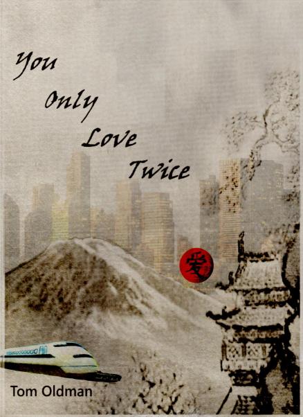
I like your last sentence, Corra. You, speaking as one who has not red the book, put your finger directly on what was bothering me. The train DOES look cut and pasted. Without it, there is a circular cohesion to the whole cover. Starting at the girl, we see her looking out the window at the buildings. Your eye reads the title and follows down through the pine tree to the tower. Then sweeps left to see the author's name (changed to the same font as the title) while above sits Fuji-san. That completes the circle. In the middle, stands the Kanji character for "Love" centered in a red ball. The train is not necessary. The girl, the font, the stylized tree, the temple, Fuji-san, and the Kanji immediately conjure up Japan.
With the girl facing away from the reader, I think it give her a sort of wistfulness.
~Tom
#1 does have buildings in the background, Corra, but they are more subliminal and blocky in appearance. As I look at it now, printed on my laser and hung on the wall, maybe a graduated tint, starting light near the bottom and going darker at the top might work to draw out the snow on Fuji-san.
I am also reminded that the MCs use a normal commuting train every working day, so perhaps that would be better than the Shinkansen. Subway trains are quite blocky but have a distinctive front shape.
~Tom
I really didn't expect this much response. For some reason, I am NOT receiving any notifications for this thread and that bothers me. I've tried unsubscribing and resubscribing, but that hasn't helped. Time to get Sol involved I'm thinking.
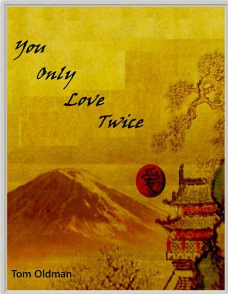
Everyone's input will be seriously evaluated by me and my daughter. She seems to be leaning toward #1 also, with an eye to lightening the yellow and changing the shade to a bit more "antique". Your last version, NJC, is a good one, too. One of the things that will happen is to make the title font a bit larger and perhaps slightly "wider". My name will change to the same font and also 1 point larger.
Would #1 improve even more if the buildings were more definid, similar to they way they are in #2 and #3?
What if the Shinkansen were removed from #2? Would that enhance the contrast from city to country, making the woman the "bridge" between them?
~Tom
My daughter, who creates artwork and scenarios for a gaming company as Lis Winter, has created three possible covers for my novel.
It would be helpful to me to get any opinions as to which one appeals to you the most: 1, 2 or 3. Sorry, I know they are large, but if they were smaller, you might miss details.
Number 1:

Number 2:

Number 3:

Thanks,
~Tom
A Preview button is a great idea. Just like getting ready to post this answer, there is a Preview button.
~Tom
Happy to have helped. I've been using Word since it first came out for Windows 3.1. Oddly enough, searches of that type do NOT work with Open office Writer. I have no idea why they didn't carry that functionality over.
EDIT: Sure, just reverse the search terms: ^p[space]. There is no rule that says you have to have text in front of the "^p". You can even use combinations like ^p^p.
EDIT EDIT: For more elaborate search missions, you can use a free program called "FileSeek". It lets you search an entire folder filled with Word documents and locate the search terms in ALL of them at once. You cannot change anything, but it will help you locate the items you need to find. It keeps you from opening files you don't need to open.
URL: www.fileseek.ca
~Tom
I assume you use Find and Replace (Ctrl-H) to locate all those little bugs. You can search for .[space]^p and locate a single space behind a period and before a hard Return.
To do that, for the Find What box, click the "More" button at the bottom. When it opens up, click the "Special" button. You will find all sorts of special characters, para marks, and doo-dads to search for. You can add these at any point in actual text for the box.
You can do the same for the Replace With box.
It makes finding and editing much, much easier. Once you get to know the special characters, you don't need the extra mouse movements as you can remember most of them. ^p is just one of them (An end-of-sentence Enter key).
~Tom
You don't say in your post, so I'll just add that you can insert a Page Break anywhere you want it using Ctrl-Enter. Your new text entry point will jump to a fresh page.
I do agree that having page breaks visible is a good idea so you can remove them if you need to.
~Tom
Wonderful, Karen. I'll be looking forward to it.
~Tom
But the phrase "freely available" isn't true of what you workshop here on tNBW. We PAY for this site, thus anything posted isn't "freely" available at all.
~Tom
I thought it might be something like that. It happens occasionally.
~Tom
Dill, I just received two notifications of your posts and, even though I am logged in, I kept getting "You are not authorized to access this page". However, I can go to my home page and View New Posts and get here just fine. I wonder if the email system is broken or something.
Sol, are you watching?
~Tom
LOL. Whoops, my bad. **adjusts trifocals**
~Tom
I thought the instructions said "Write the closing SENTENCE of a story inspired by this image." Was I wrong? Although I enjoyed the entires, I think that a sentence should just be a sentence. ![]()
~Tom
"Well," Dorothy sighed to herself. "At least Tinman and Lion got their wish."
~Tom
How about "knelt" and "kneeled"?
~Tom