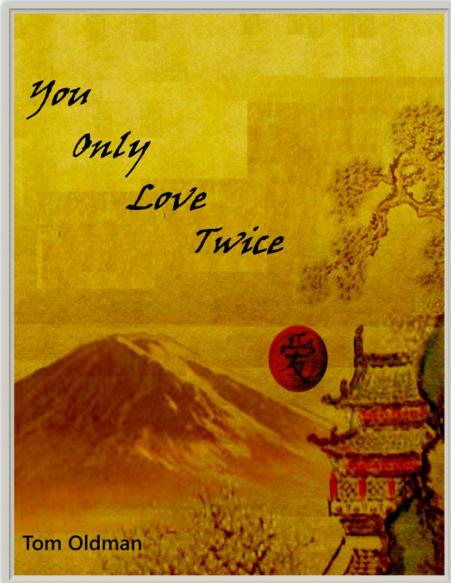
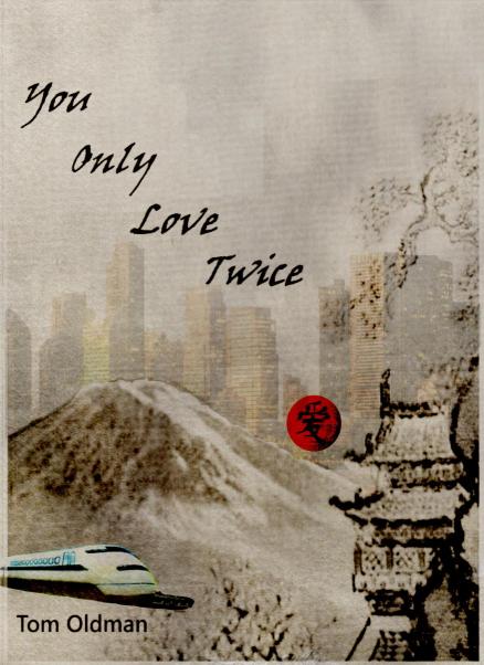
Oh, I'm sorry! I can see that now. I hadn't noticed the impression of buildings in the first, even after studying it for a few minutes! I did notice a subtle geometric impression in the background of the first, at the top. I didn't realize they were meant to be buildings. It might be an issue of how large the cover is on my screen. To me the impression of buildings in the first looks like geometric pixels which my brain simply tuned out as background. I assumed they were meant as pattern.
Well, obviously I like my version of simplicity in the top half of cover #1  but if you want to keep the buildings in it (which could be excellent), I do think adding some more definition to the buildings would make them more clearly buildings. (I'd) still keep them really subtle and subliminal. Maybe not quite so subtle, ha ha! Now that I realize they are meant to be buildings in #1, I like the contrast between the mountains (nature) and the buildings (industry/civilization). It reminds me of a novel I read once (Volcano by Shusaku Endo.)
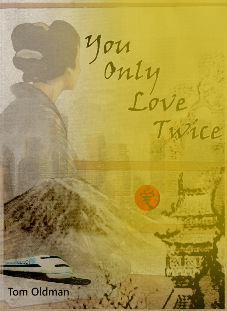
I like the idea of making the color on the first more antique. But I also like it as it is -- with the rich yellow.
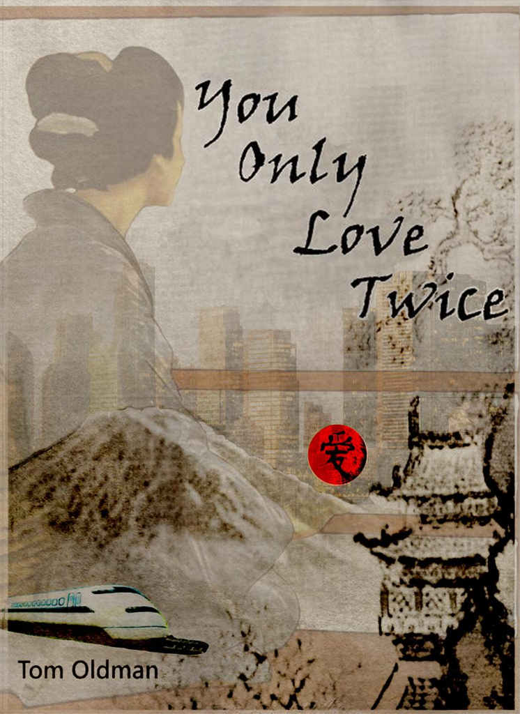
And like I said -- I like the snowy white ones too, with the woman. They're all good. I think the subway/Shinkansen would be/is too much. I'd remove the train or Shinkansen altogether. I like what you say about the woman's face bridging the image. I feel like having the train in there takes away from that subtle mystery of the woman, the buildings, the snowy mountains. The train doesn't really add much, imho, and threatens to appear cut and pasted. The rest has a symmetry, while the train looks pasted in.
An entirely biased opinion based on personal preference. Also bearing in mind I have no idea what the novel is about...


